So despite the thousands upon thousands of designs on sites like Minted and countless Pinterest searches, you can’t seem to find a wedding invitation you like. Sure, some couples do have the rare singular vision for how they want to announce the occasion (boat anchors? tandem bikes? ivory embossed on ivory accented with more ivory?). But for most people, searching for the right invite can feel like searching for a one-size-fits-all visual embodiment of two different personalities.
So you look for inspiration. The season. The setting. The colors. The theme. But what if all those still leave you feeling…uninspired?
Try thinking architecturally. For our most recent custom invitation project, the bride and groom wanted to use an element of the wedding venue as a design cue for the invitation. But while it was located in a place with special meaning to them, the area itself didn’t offer a lot in the way of appealing iconography.
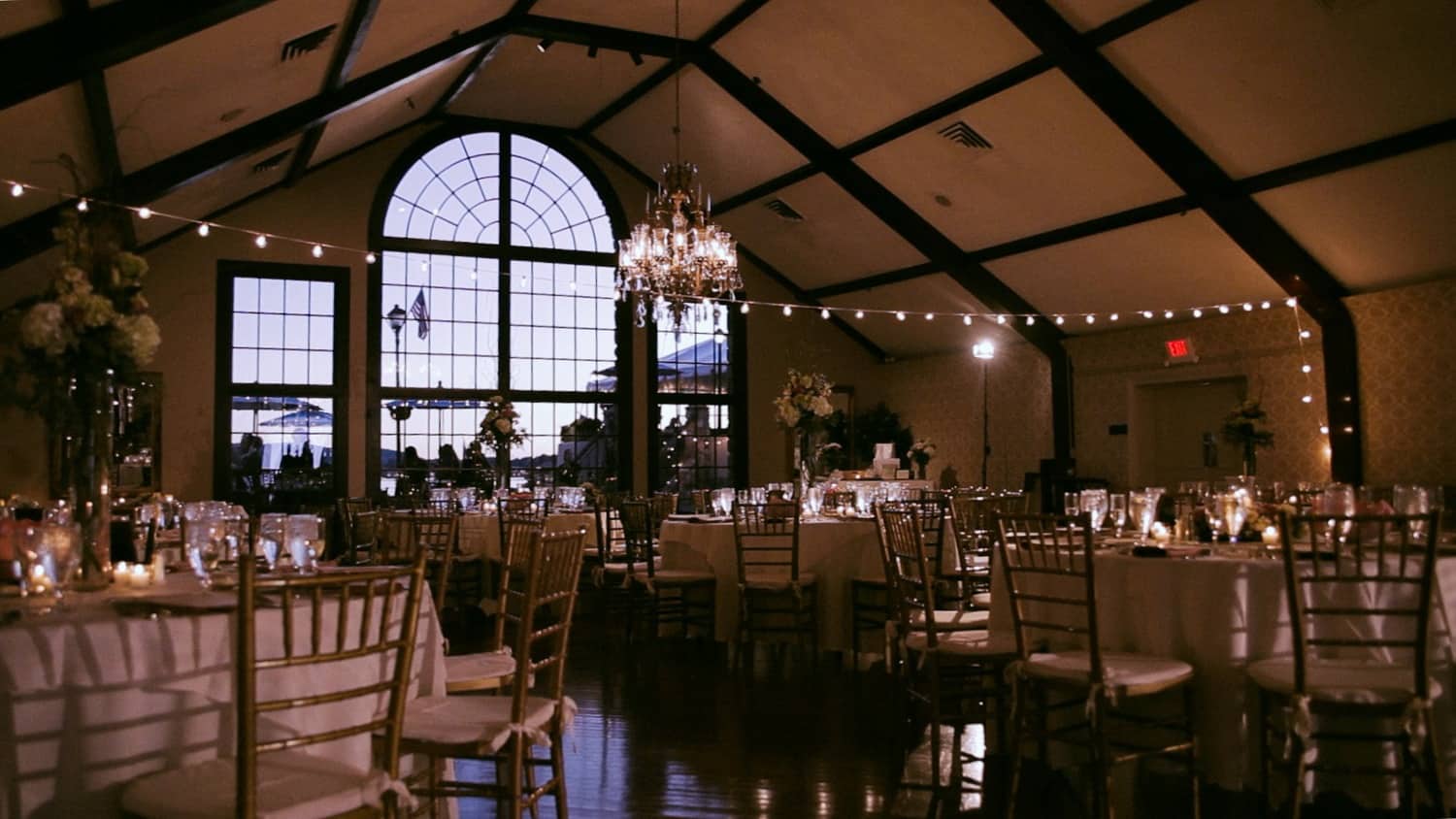
That’s when we started to look at the structure of the building itself. And one striking feature jumped out: the graceful, floor-to-ceiling arched window at the center of the of the main ballroom, which looks out on a boardwalk and sparkling lake beyond. Check it out below. Timeless, beautiful, and perfectly symbolic! Glimpses of the finished suite to follow.


