When we’re not using our creative skills to increase the value of our clients’ brands, we are spending time writing and designing for our sister company (no pun intended). Upper Notch Press is our creative outlet, where we combine original poetry and prose with original artwork to create prints, apparel, invitations, and any other medium we want to explore. We’ve set up shop on Etsy and have been adding products over the last few months that we’re excited to share.
Our personal lives inspire so much of our creative efforts, we thought we would depart from the norm today for a peek at a little home project—the nursery for my daughter, Lily. When I was starting to work on transitioning our guest room (which enjoyed a brief but glorious two and a half years as my favorite, most peaceful room in our new house) to a nursery, I looked around online for inspiration and found some useful stuff. So now I’ll share the results for future DIYers and planners in search of ideas and visual sparks.
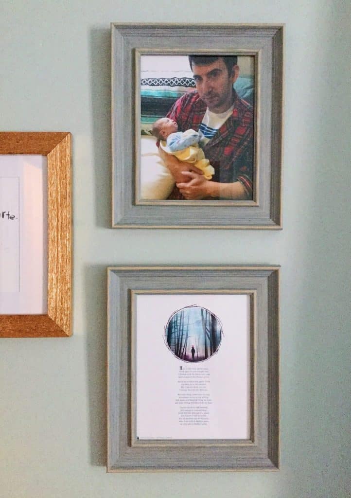
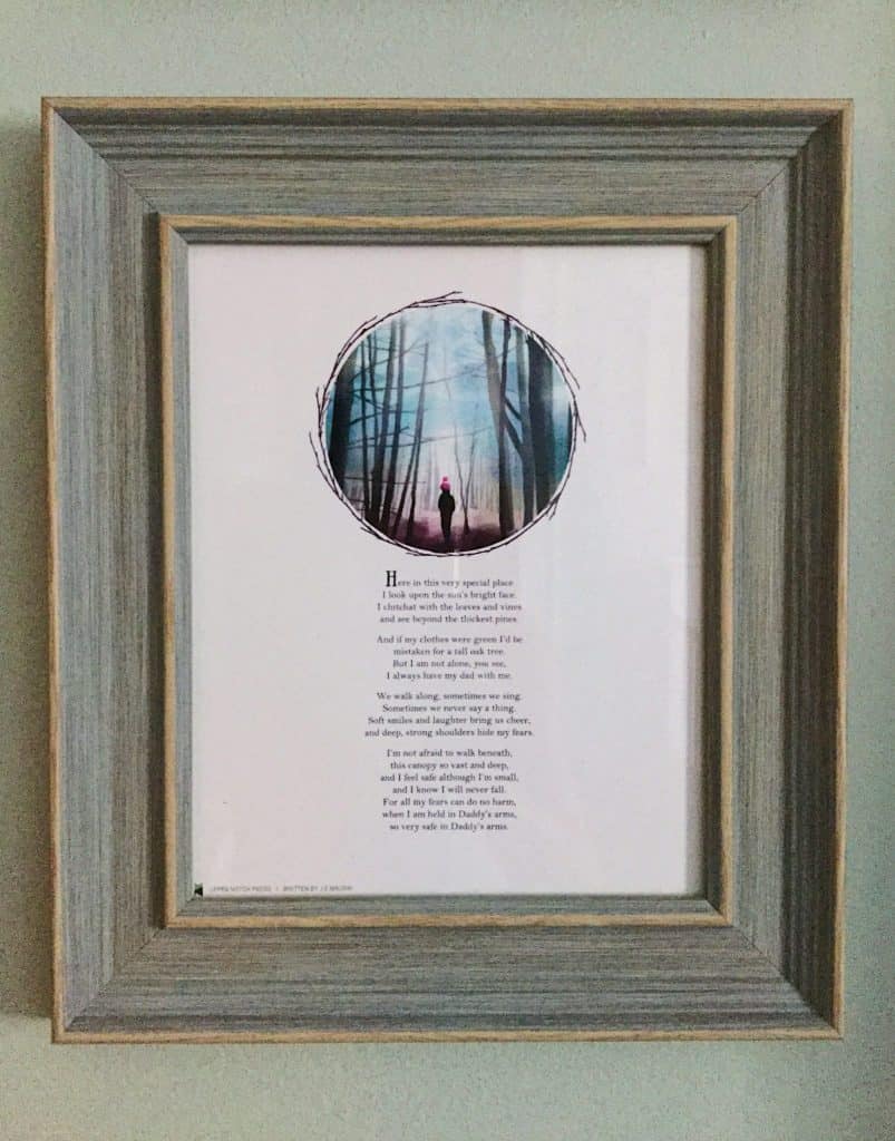
I am also extremely happy to showcase our “Daddy’s Arms” print, which has a lovely home on Lily’s wall next to a framed picture of her with my husband. She is truly a daddy’s girl—in fact, her first official word (“Da-da”) just went into the record book two days ago, and she enjoyed her first family hike this past weekend while snuggled next to daddy in her carrier.
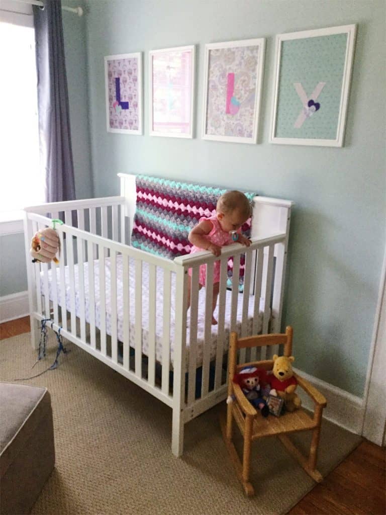
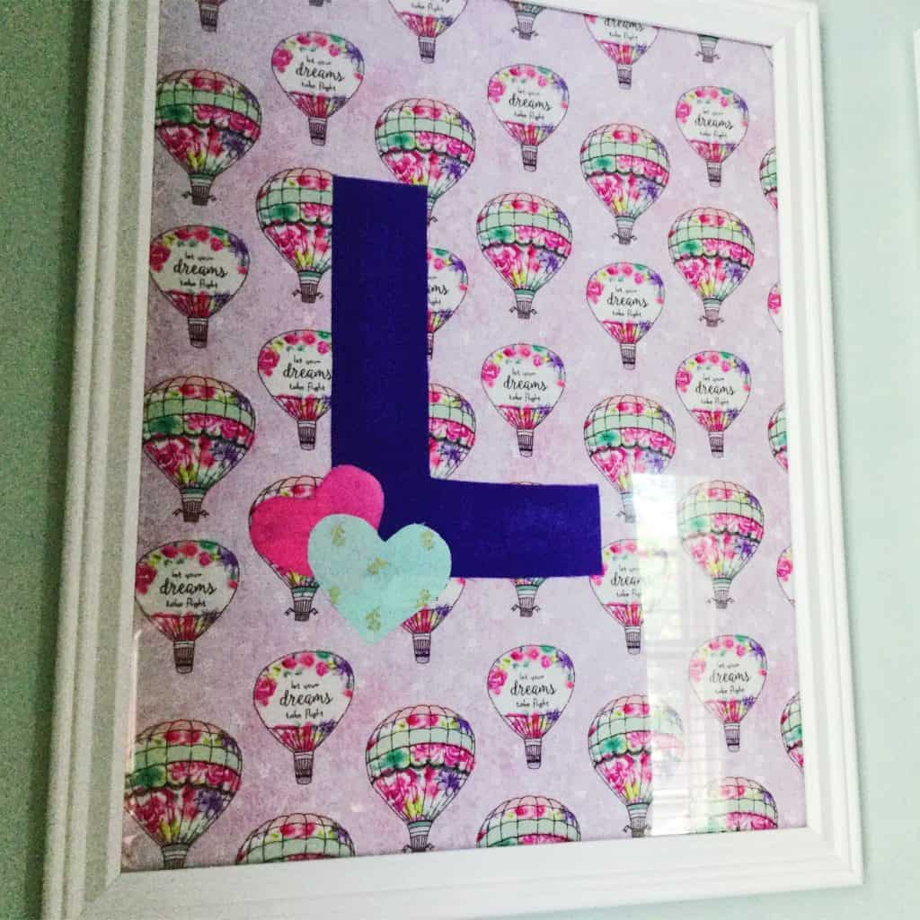
I wanted something large-scale to span the wall behind her crib but couldn’t find any artwork or kids’ posters that felt right. So after she was born, I picked up some frames from Michael’s and a few yards of fabric from JoAnn (I make this sound simple, but it took me much, much too long to choose coordinating prints and solids—though I do love the ones I finally selected). Then I covered the hard frame backing with fabric, cut out the letters of her name along with a couple hearts and fixed them in place using basic fabric glue. It’s playful and original and fits the space perfectly.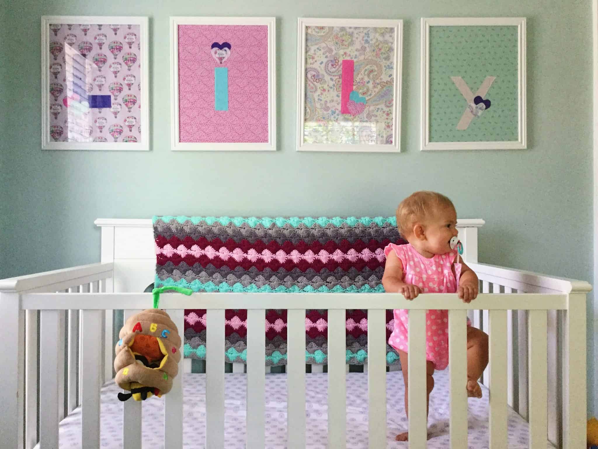
The space in the nursery is very limited (mostly because we ordered the largest-ever rocking armchair that fits two babies and and very nearly two adults). So instead of spending lots of money on a full-size dresser, I started researching Ikea hacks. I settled on an unfinished Ikea dresser that the store no longer carries, but it is very similar to the new Tarva. When we first bought our house, I did an Ikea Hemnes nightstand hack for the guest room, and so I decided to use that as a table near the armchair and then match the dressers to it, thinking down the road Lily can use it by her bed. I made two, one of which currently lives in the closet, but when she’s older and no longer needs a changing table, the second one can come out into the room. For now, it houses the next size up of clothes for easy rotation.
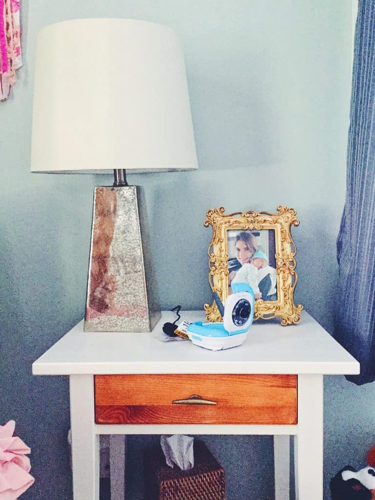
I first stained the drawer fronts (using an all-in-one stain, so no priming step) and spray-painted the other pieces of the dresser—and here’s where I became obsessed with spray paint, though I have to say I think you would actually save time and money just using regular paint and a paintbrush. It takes A LOT of spray paint to cover even two of these small dressers. Like, three restocking trips to the hardware store.
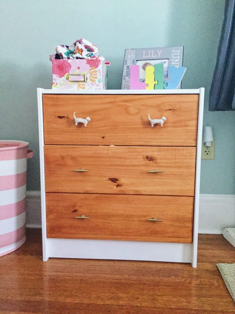
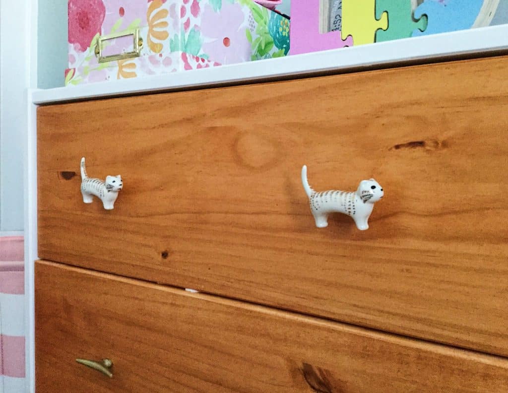
Then I assembled all the pieces and added different knobs for personality. We used a combo of the popular Streamline Knob and the Furry Companion Knob from Anthropologie (which has since sold out). My husband picked the kitties—both my son, Jack, and Lily love to play with them.
I took my newfound love for spray-paint and—armed with some Pinterest-found tutorials—decided to upcycle some of the decor that had been in the guest room already. First was an oversize mirror to hang over the changing table. If you don’t have a mirror next to your changing table, you are missing out on a lot of reflection-based fun.
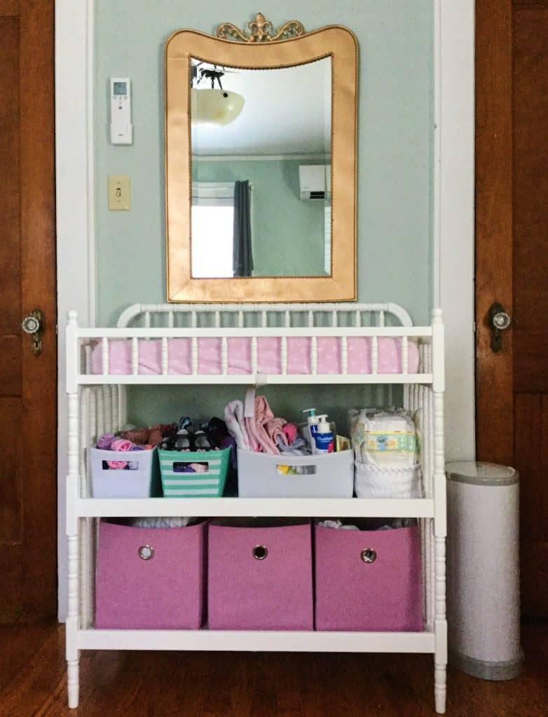
Next came a picture frame to go with a gift from Jacqueline—a reproduction of a sign I had scrawled as a little kid, which was formerly hanging in a bedroom at our parents’ house. Sray-painting is so easy! I became a little overzealous and coated a bunch of other random things—e.g., an old wicker basket, a stainless-steel hanging rack—but not everything made the final cut.
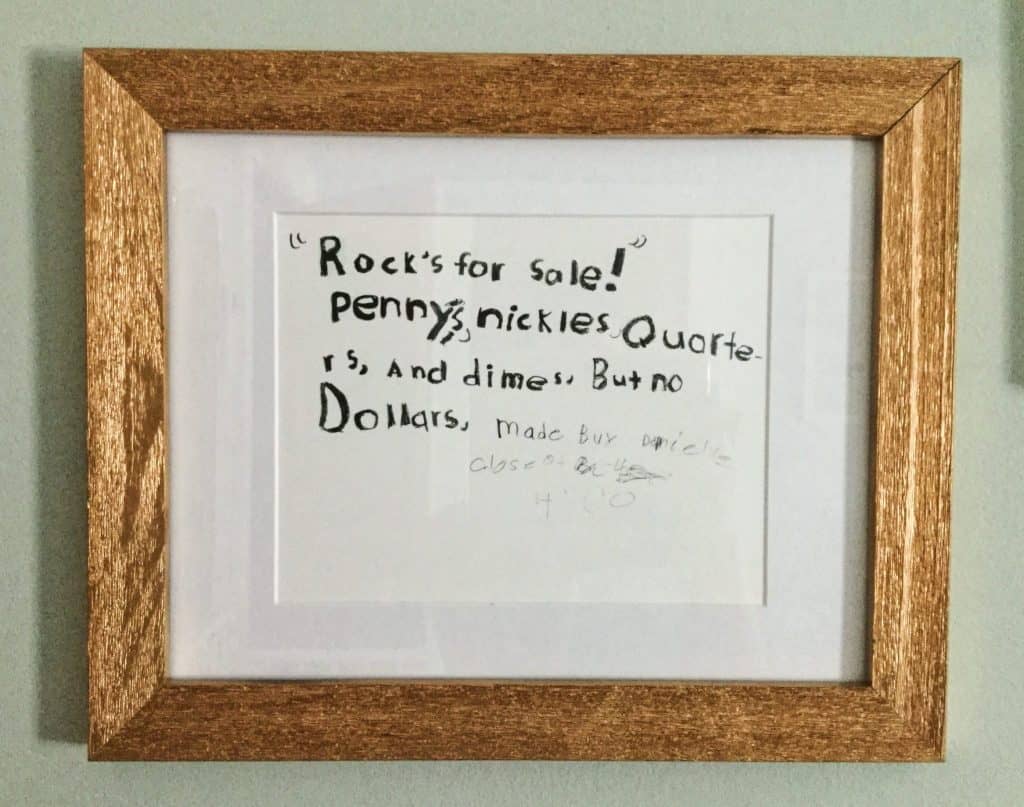
The sign hangs in a collage with two other very special pieces: matching frames with a picture of my husband holding Lily only a day or two after we brought her home and our print “Daddy’s Arms” in the blue color scheme with vertical orientation. The trio hangs above her dresser for a cute corner nook. And that’s it!
