
Looking for real estate logo ideas? Take inspiration from two of Upper Notch’s latest realtor branding projects.
In the real estate world, first impressions and powerful marketing are critical for success, especially for up-and-coming real estate professionals building a reputation in the market. Having a well-designed, unique realtor logo is an essential tool every agent can leverage to improve their personal “brand awareness.”
In many industries today, people are their own distinct “brands”—real estate professionals, fitness trainers, therapists and counselors, authors and artists, animal trainers, consultants, even medical, legal, and other business professionals with private practices. Even though they might be part of a larger corporate brand, their business is driven by individual performance and building key customer relationships. Having an effective logo is an invaluable tool for these professionals.
Angela Sullivan is a licensed realtor with Berkshire Hathaway – Verani Realty in Bedford, New Hampshire. As a savvy marketer, she recognized the value in creating her own personal brand. She asked Upper Notch to design a logo that would reflect her personality—approachable and chic—and also resonate with her key client base.
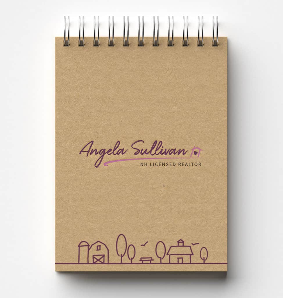
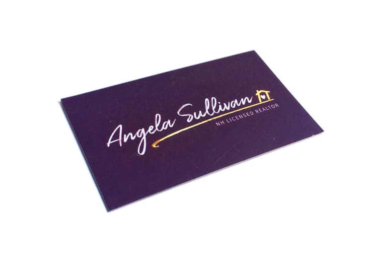
To blend familiarity with a bit of luxury, we used a font reminiscent of a signature and had it embossed in gold foil on Angela’s business cards. As an additional element to be used on various marketing materials, we illustrated a line art scene that included a park bench, barn and country home—all structures common in the towns Angela serves.
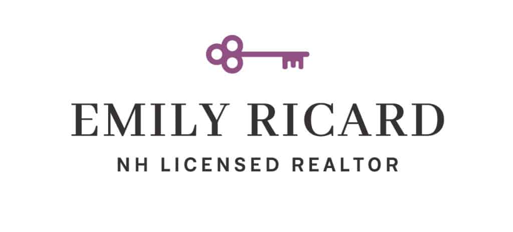
Licensed New Hampshire realtor Emily Ricard, also with with Berkshire Hathaway – Verani Realty, came to Upper Notch for a custom logo design that would represent her personality and make a compelling statement to potential clients. She was looking for something that felt traditional, with a bit of femininity and charm.
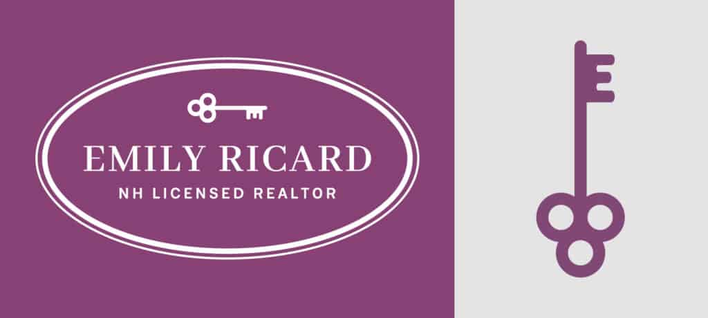
The resulting logo features a key—a welcoming invitation as well as a promise of future home ownership realized—and Emily’s name and credentials in a classic slab serif and modern sans serif font, respectively. To make the key graphic uniquely Emily’s, we formed the key’s teeth into the letter “E,” a subtle visual play that adds a layer of sophistication.
Looking for a logo to make an impression and enhance your business profile? Contact us today.