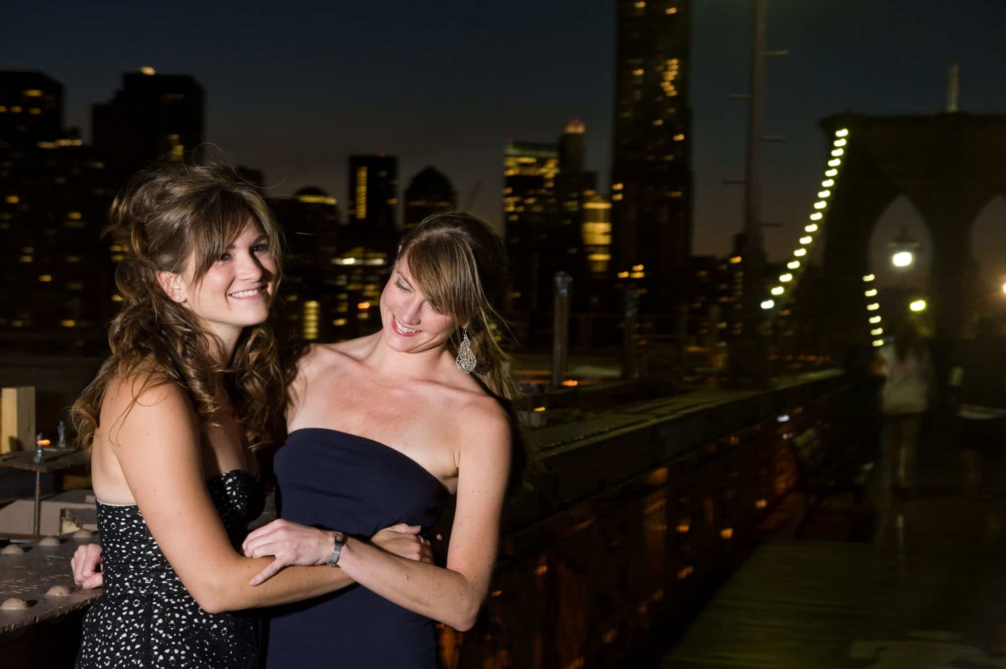
When Danielle and I first moved to Manhattan in 2007, we lived in a closet of an apartment down on Gold Street in the Financial District. At this time, Danielle was on a mission to turn me into a runner (she did succeed, though not without much complaint on my end), and many mornings we would stumble out of our building and push through the crowds of Wall Street bankers rushing to work to start our downtown route.
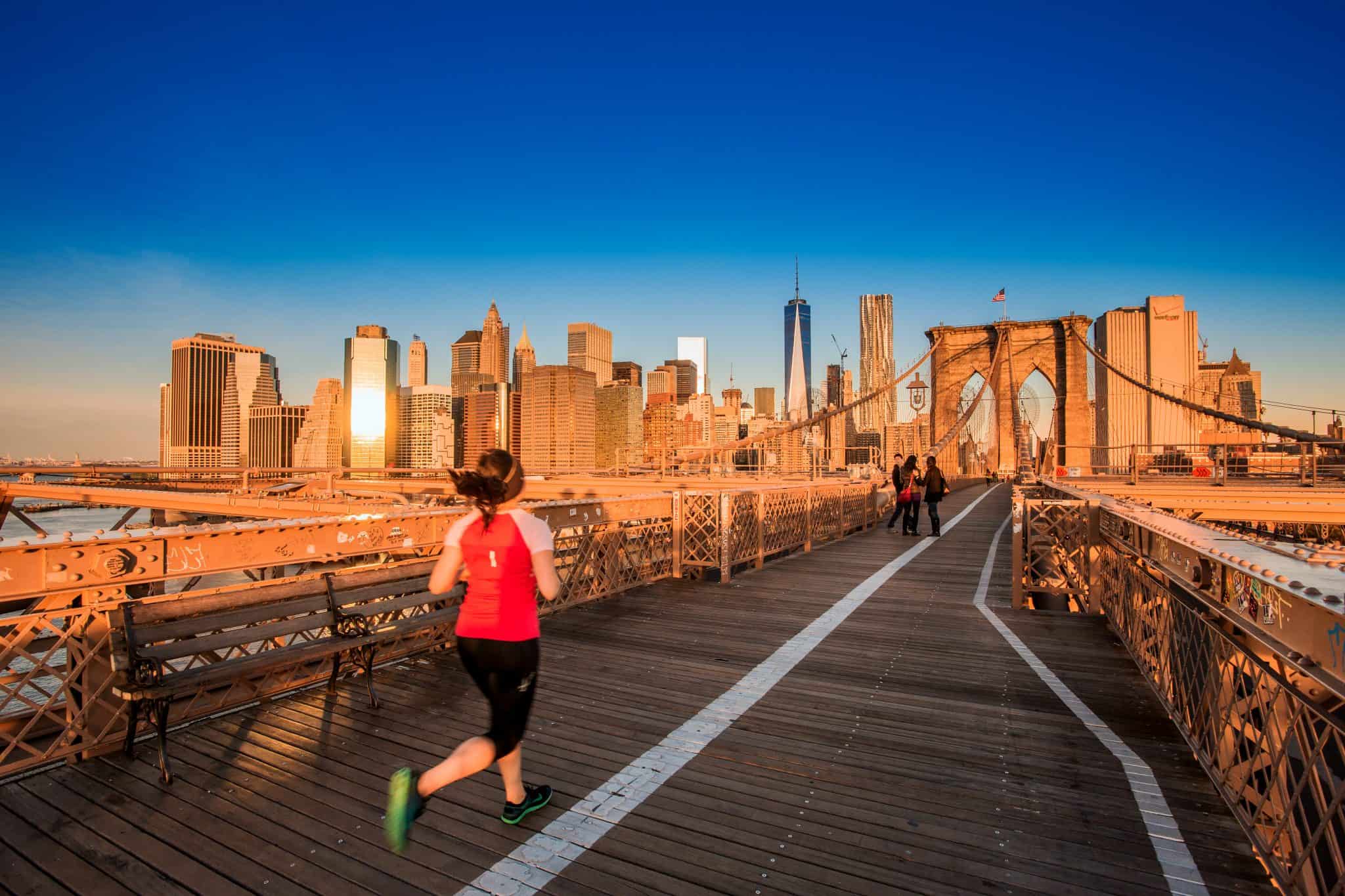
After jogging (shuffling for me) along the path through Battery Park, fueled by coffee and Danielle’s enthusiasm (she has always been a morning person), we would sometimes tackle the Brooklyn Bridge before returning home. The bridge was always a love/hate experience. You climb up, then fly down to reach the Brooklyn side, and then of course climb back up and then down again to Manhattan. During the uphills, I mostly panted and muttered things like, “I cannot breathe. I am dying. You are killing me,” while Danielle apologized on my behalf to morning commuters walking by. And on the way down, without fail, Danielle would always say, “Never walk downhill. It’s the perfect opportunity to perfect your form.” To this I would roll my eyes and grumble between gasps of breath– walking downhill was the only thing I wanted to do at 7 a.m.
Now while running downhill the incorrect way may be easy, the correct way is not. Running downhill the wrong way—legs out of control and arms flailing about (anyone see that episode of Friends when Phoebe runs?) gets you to the end fast but makes you much more vulnerable to injury, collisions with unsuspecting passersby, and being the subject of some meme about poor running form. It is way harder to run downhill the right way—intentionally tightening your abs and opening your stride so you don’t kill your knees. But doing so makes you stronger and a better runner.
Now that we no longer live together and I run by myself on most days, I still hear Danielle say that line every time I go downhill. I also think about it whenever we do a design as a favor for a friend or a pro bono project. It is easy to walk or sloppy-run downhill and it is easy to do a design that is “quick and dirty” because it’s free—a design that fulfills the requirements without trying to do something great or make the most out of the experience. But just because you can phone something in, doesn’t mean you should. Instead, it could be the perfect opportunity to try something new, push limits—to perfect your form.
Over the last year, we’ve had a few opportunities to design logos pro bono for some great companies and friends while still flexing our design muscles. Here are two of our favorites:
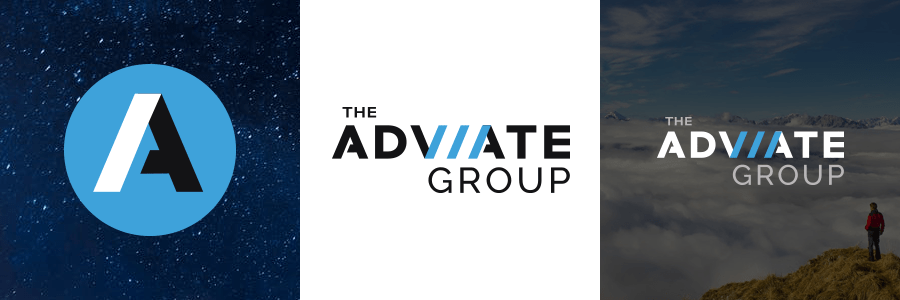
The Adviate Group is a creative agency founded by my former-colleague and good friend, Michael. The Adviate Group provides strategic, creative and technical services for mission-focused companies and organizations seeking to refine their message, broaden their outreach and increase their impact. Michael came to us for a logo that would convey the supportive nature of the company while also communicating its versatility and positive energy. We were more than happy to help.
A solid, sans serif font serves as the base of the logo. Three right-angled lines of the type are highlighted in cyan to create forward movement. The tightness of the lines creates a slight vibration against the negative space between them. This effect creates energy in the logo, making the overall mark strong and dynamic.
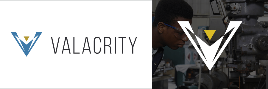
Valacrity is a start-up company based in Boston, Massachusetts, and founded by a friend that has helped Upper Notch from the very beginning of our formation as a company. Valacrity is paving the way for design software for Smart-Glasses. While we can’t reveal too much of what this innovative group is creating, we can say that they needed a brand that effectively represented the edgy and highly technical AR work that they do, while nodding at their space within the Smart-Glasses industry.
The mark of the Valacrity logo is a V shape that has been fractured to show segments within the letter. In the center is a yellow triangle, all together creating the impression of a figure. The strokes of the V suggest arms reaching up; the yellow triangle, a head. This supports the idea that when a user is utilizing Smart-Glasses, they are essentially “hands-free” and able to obtain information without abandoning their work.
It is an honor and joy to create brands for friends and organizations to help them effectively represent the great work that they do and unique services they offer while pushing ourselves creatively to design thoughtful and unique identities. And I am happy to say I’ve come a long way from shuffling down the Brooklyn Bridge—I really do like running downhill now and am constantly striving to perfect my form.