Here’s something you probably don’t think about often: What—visually—inspires you to work out? Or to choose to buy and prepare nutritious foods over less healthy ones? What colors and images represent fitness and well-being? It’s a challenging question to answer, when you really try to isolate your visual intake and the corresponding psychological, emotional and—especially in this case—physical responses.
We recently had the opportunity to consider this question while developing logos and brand identities for three separate clients, each with three different professional niches within the health and fitness realm. It’s fascinating how many directions you can actually explore within this category. In some instances, the more literal iconography (dumbbells and figures in motion or fruits and vegetables and plates and silverware) is most effective as a starting point. In others, more metaphorical concepts lead to totally unique yet universally compelling symbols for transformation.
Each of our (totally motivational) clients uses her distinct expertise and skill sets to help people improve their health and well-being, and their personal methodologies and personalities factor heavily into how they want to visually present their brands to the public. Here are the logo designs we developed for three professionals in the health and fitness industry—each dramatically different and singularly inspirational.
As a registered dietitian, Julie of Nutrition365 provides comprehensive nutrition plans to help clients lose weight, improve their health and develop healthy relationships to food. She had a name and a tagline, “Your Recipe for a Healthy Lifestyle,” but she needed a logo. The finished design presents a right aligned, script font paired with an abstract apple graphic, with small ticking marks to suggest a clock and capture the “every day” aspect of “365.” Julie gravitates toward vibrant colors (hello, fruits and veggies!), and the bright green is fresh, natural and energetic. The curvilinear lines make the logo more friendly and approachable while the minimal color palette and traditional sans serif typeface keeps things clean and sophisticated.
Sarah Hross is a born motivator: After achieving truly life-changing results through her own personal weight loss challenge, she decided to share the successful strategies she had learned with others. Her company involves three distinct segments, and each needed its own logo that could stand alone but also tie together cohesively. We developed three fitness-themed logos (as part of a larger website development project—more on that to come!), each conveying its unique identity as part of Sarah’s “Infinite” empire. Infinite A-Game, her personal brand, is a visual combination of the infinity symbol and an “A.” The logo for The Infinity Challenge, Sarah’s proprietary partner-based fitness challenge, again uses the infinity symbol but incorporates clear action-based iconography of a figure lifting weights. The third subset, Team Infinite Superheroes, has the most playful logo, representing Sarah and her crew of challenge leaders, who are determined to make health and fitness fun.
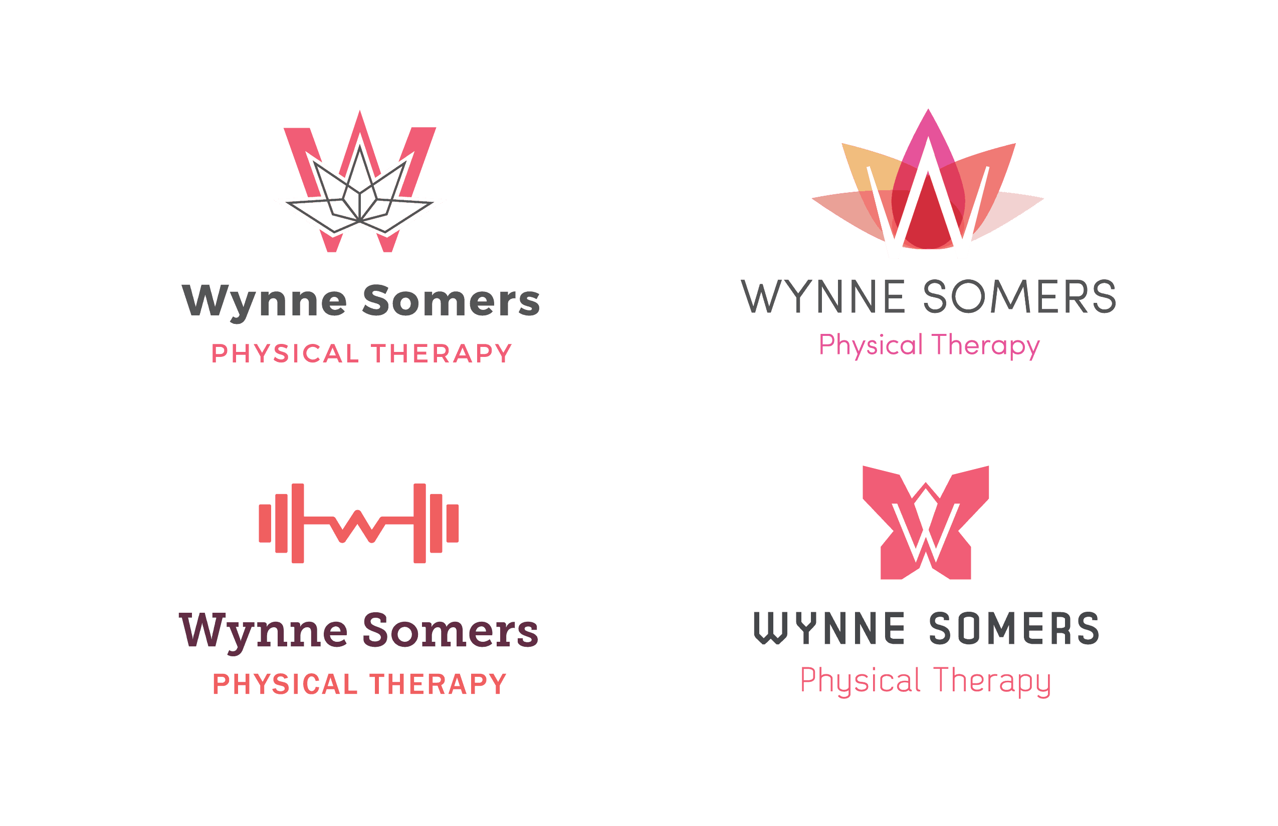
Our final set of logos was created for a local licensed personal trainer, physical and respiratory therapist who needed to develop a visual identity for her growing business. (As she is still in the process of deciding, we have changed her name in these mockups.) We explored several different directions, shown here. The first two concepts explore the idea of a lotus and use the “W” of her name to echo the shape of the flower. The first strikes a balance of strength and femininity through use of geometric lines and softer shades of pink and coral, while the second uses more saturated tones and contrasts the softness of the petals with the sharpness of the “W,” creating balance and opening up the shape.
The third concept is more literal, incorporating the shape of a weight and manipulating it to suggest a “W.” It is straightforward but unique. The fourth concept is also metaphorical, using the shape of a butterfly to represent transformation and the respiratory work the trainer does. The shape is geometric, to keep it strong and sharp and balance the very feminine butterfly symbol.
These logos demonstrate how powerful it can be to develop a custom brand identity for your company, especially if you are just getting your business up and running or are self-employed and want to demonstrate your uniqueness and professionalism to your audience. Get in touch to talk about your logo or brand identity needs.

