New Hampshire-based design agency Upper Notch created a fresh new logo design for East Coast Field Dog, a local dog training company based in Hollis.
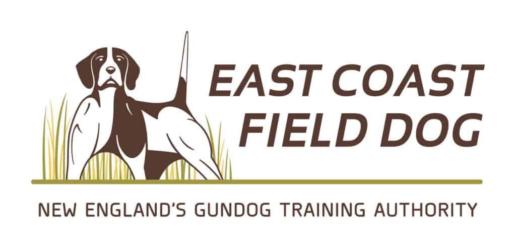
The tradition of field dog training is deeply entrenched in the Northeast, and the owner of Hollis-based East Coast Field Dog has been working with pointing and flushing breeds for more than 15 years. But with a new generation of dog owners looking for the perfect hunting companion, it was time for East Coast Field Dog to get a new logo that would reflect tradition yet appeal to contemporary hunters. Upper Notch created a logo design, complete with a solid tagline, that showcases the strength and beauty of the canine form in a classic field stance.
We often see pet-focused marks that are cartoonized or feature a dog bone, bowl, or paw print, but this project required something entirely different. The representation of the field dog’s power was a priority for East Coast Field Dog’s founder, John—the flexed muscle, poise, and focus of a field dog at hunt. John wanted the brand’s logo to modernize this classic pose to distinguish his unique training philosophy from that of other field dog trainers in the area.
For inspiration, we looked to the physical form of classic hunting and birding dogs—the English pointer, English setter, Brittany, Springer Spaniel, American Water Spaniel, and Cocker Spaniel, among others. With John’s expert direction, we studied some of the iconic pointing dog stances to inspire a logo that was authentic and recognizable to those familiar with field dog hunting.
As brand designers know, logo creation is an iterative process. Ours always begins with traditional sketching before transitioning to the screen where variation upon variation is created as we revise, revisit, combine, and ultimately arrive at a graphic we’re satisfied with. For East Coast Field Dog, it was a pleasant first to have dogs be the focus of this process. And (dare we say “woof”?) we certainly had a lot of dog graphics by the end. Here’s a peek:

For a color palette, John wanted to use a deep brown typical in hunting dogs and the slightly de-saturated greens and yellows found in hunting fields. The grass surrounding the dog adds natural depth to the logo, but the mark is simple enough to translate nicely to various mediums, such as East Coast Field Dog T-shirts, stickers, truck decals, and more.

The final tagline, “East Coast Field Dog: New England’s Gun Dog Training Authority,” is direct, informative, and compelling. And it should be. With a reputation as solid as that of East Coast Field Dog, “authority” says it all.
Need a new or updated logo design or tagline for your company? Contact us today.

